Previous work
Products I designed for Gezhi Health, VMware, Tianxianjun, Alibaba Health and Adobe. The screens are shown as they shipped, so they reflect the design of their time; the notes explain the decisions behind them.
Gezhi Health Tech2022
Yueya: managing blood pressure inside WeChat
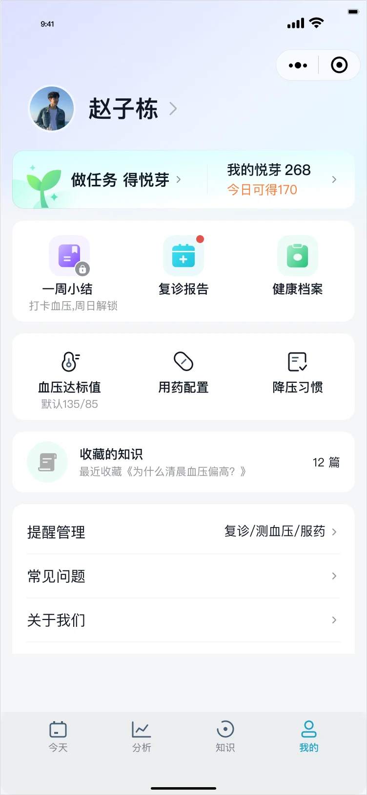
A WeChat Mini Program for people with high blood pressure: record readings, build habits that lower blood pressure, and read health content they can trust. I was the embedded UX expert in a BCG-led project and designed it end to end.
- Role
- Experience Design Expert, contract
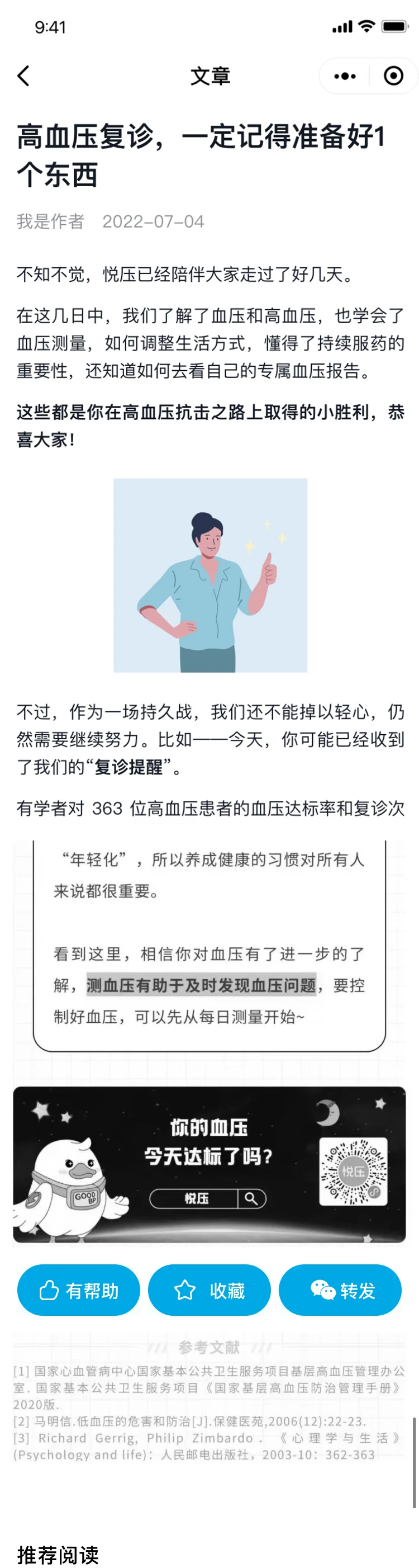
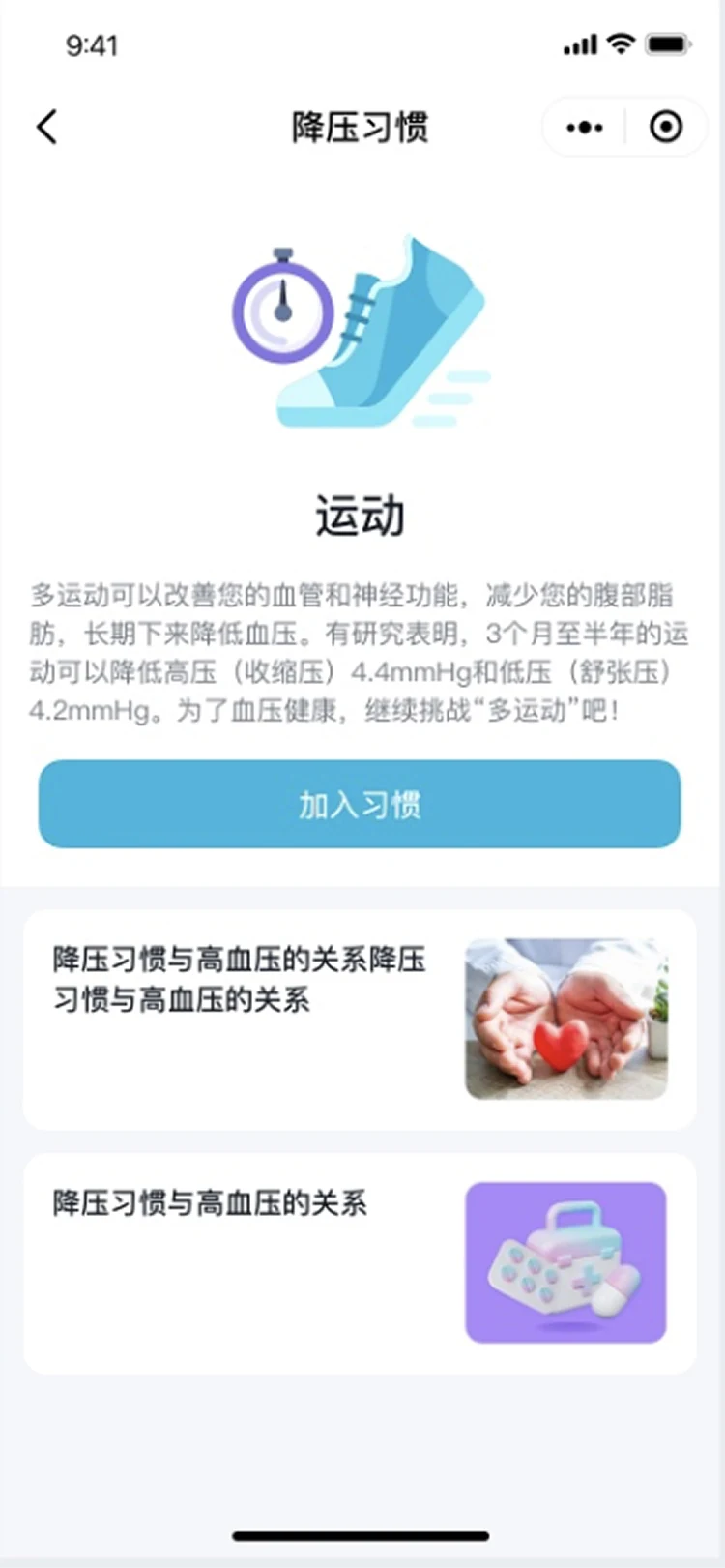
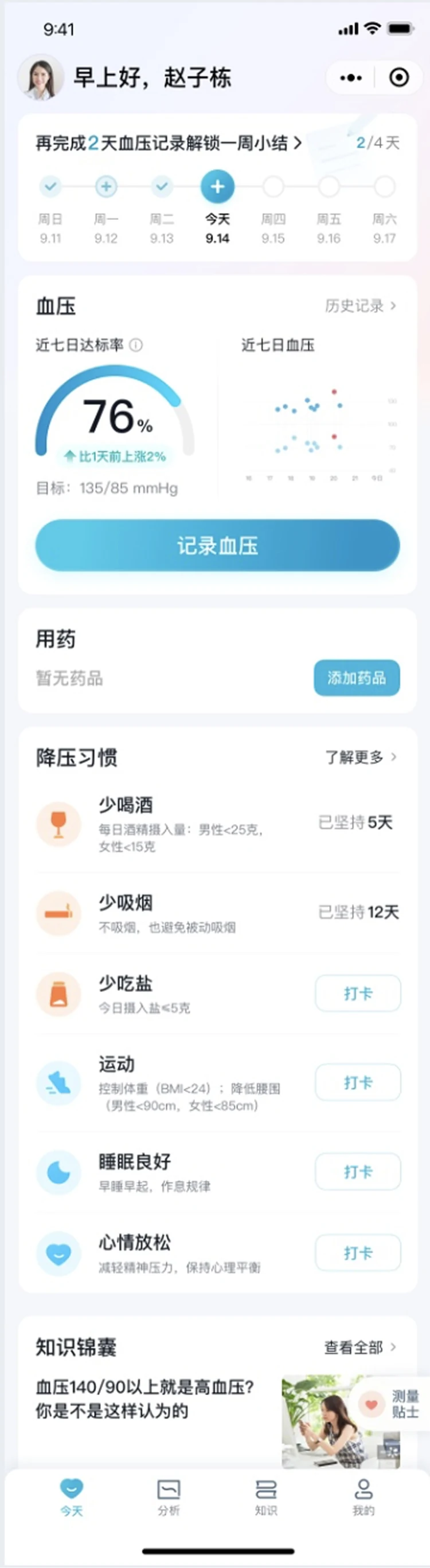
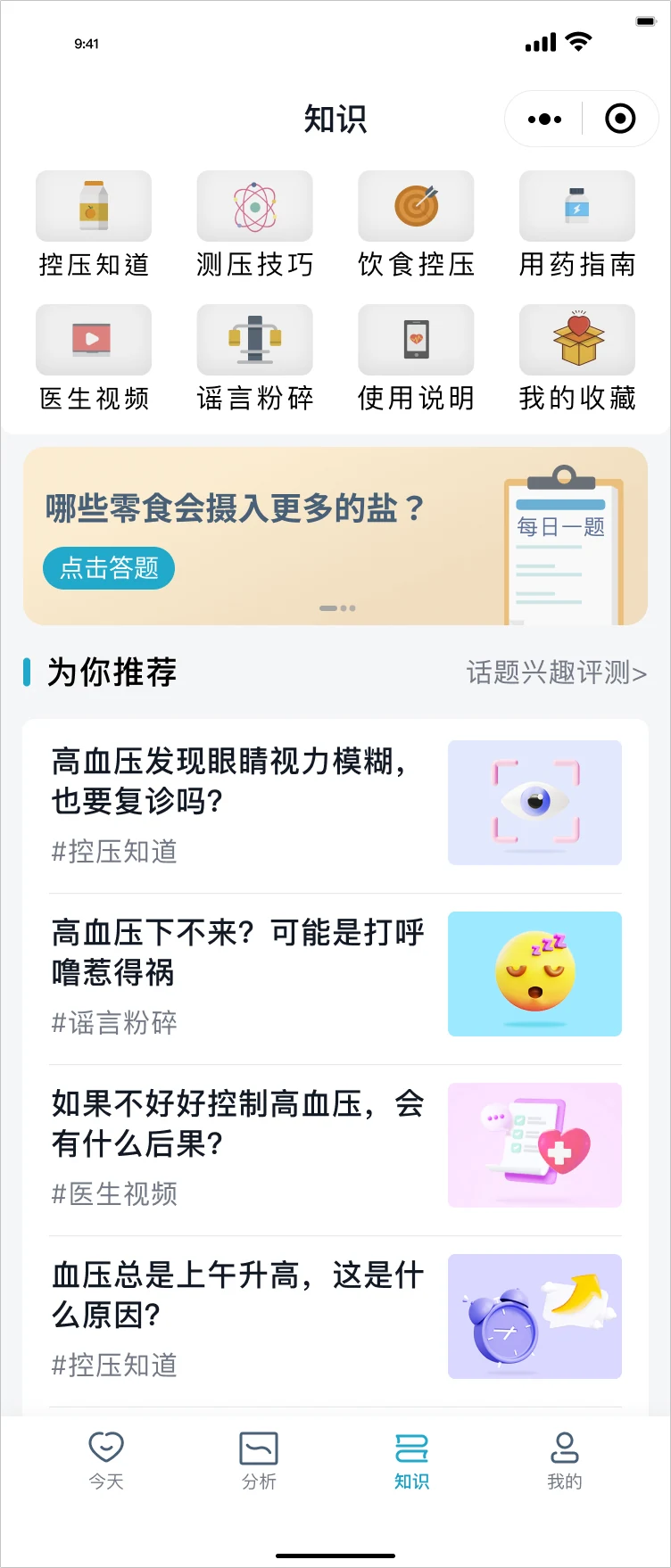
One home for the day
The home screen gathers today’s readings, medication and habit check-ins, so a daily routine takes one screen.
Explain before asking
Each habit says how it affects blood pressure before asking people to commit to it.
Knowledge by everyday question
Articles are grouped by questions people actually ask, such as diet, measuring and medication, rather than by medical category.
VMware2020–2021
DevOps Portal: every version in every environment, in one view
An internal portal for developers across VMware’s global R&D centres. It brings version, test, bug-fix, environment, branch and release data from separate tools into one place, and shows each user the parts their permissions allow.
- Role
- Senior UX Designer, project contract
- Design system
- Follows Clarity, VMware’s design system. Where Clarity had no suitable component, I designed new ones in its style for the products I worked on: the status table, the complex dropdown and the multi-filter.
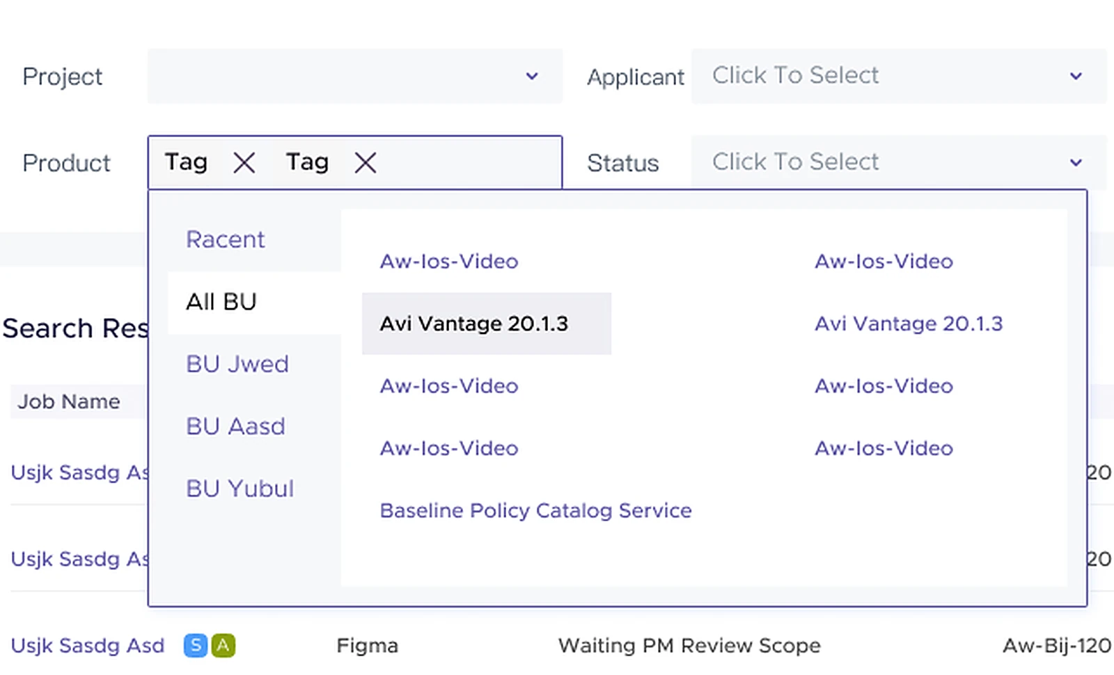
Environments across, versions down
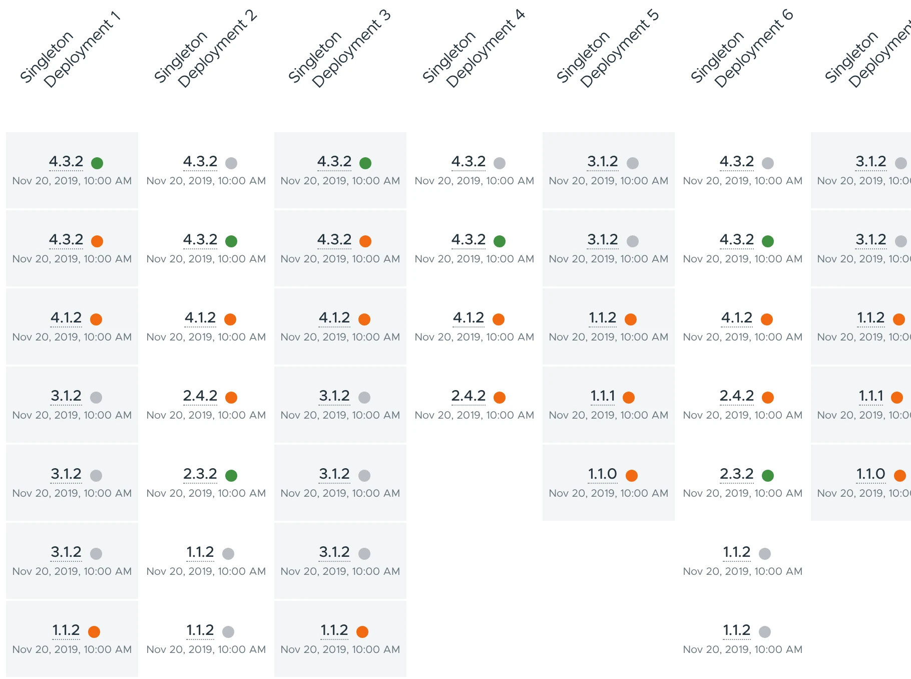
User surveys showed people compare versions more often than environments, and vertical scrolling is easier than horizontal, so the longer, more-used list runs down the page.
Columns expand for detail
A collapsed column shows only version and status. Expanding it adds that environment’s detail without leaving the table.
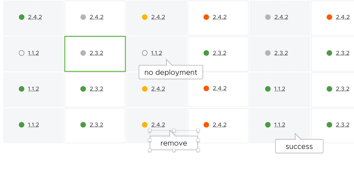
Status as a coloured icon
Each status became an icon colour with a tooltip, so a dense table can be scanned for failures. Colours meet WCAG 2.1 AA.
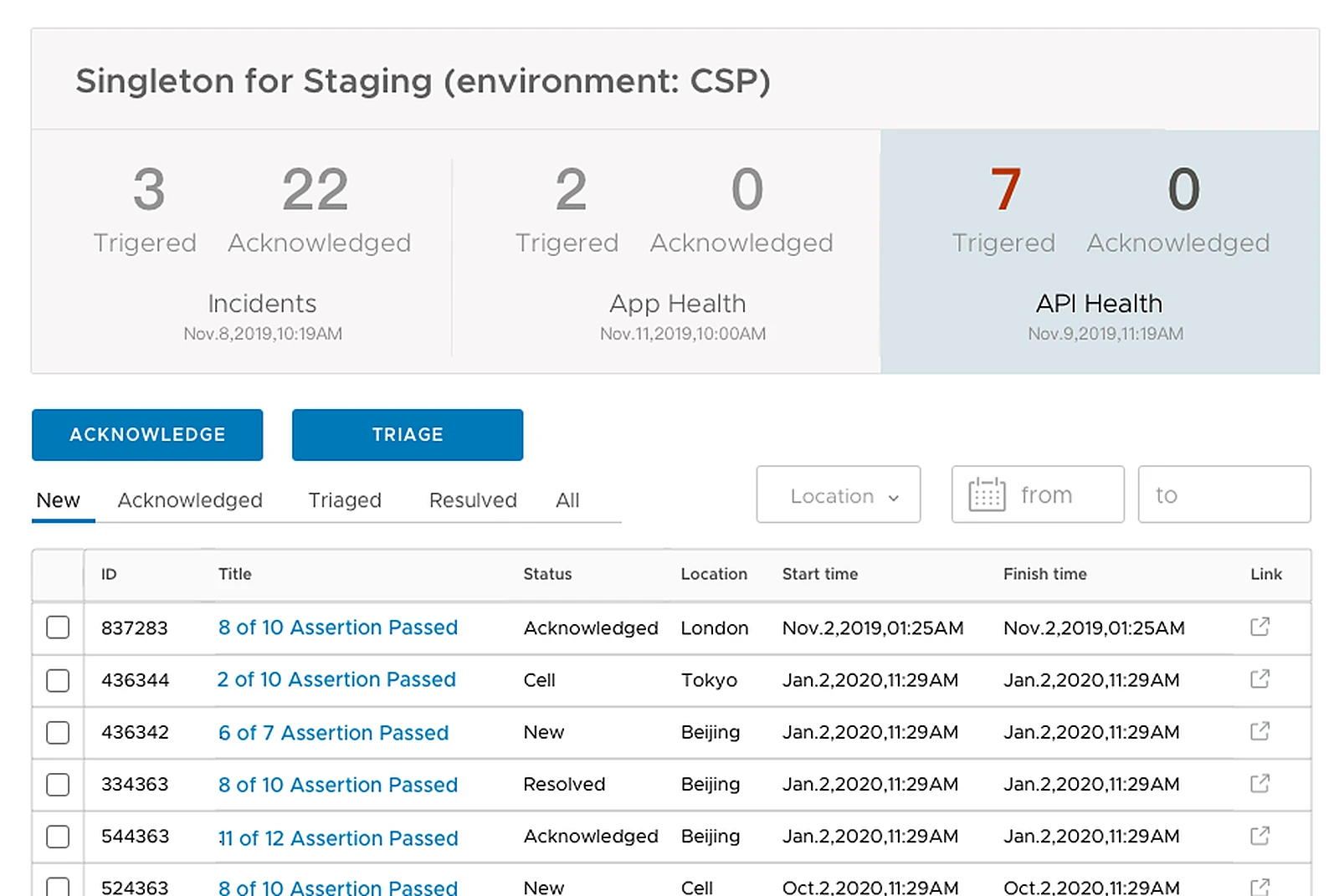
Key counts first, detail second
The numbers people check first sit at the top of each environment page; full records open on a second page from a link on each row.
VMware2021
UI Validator: a browser extension that flags insensitive wording
Used in web product testing and community moderation. The extension scans the text on a page, flags terms that may be offensive, explains why, and suggests replacements.
- Role
- Senior UX Designer, project contract
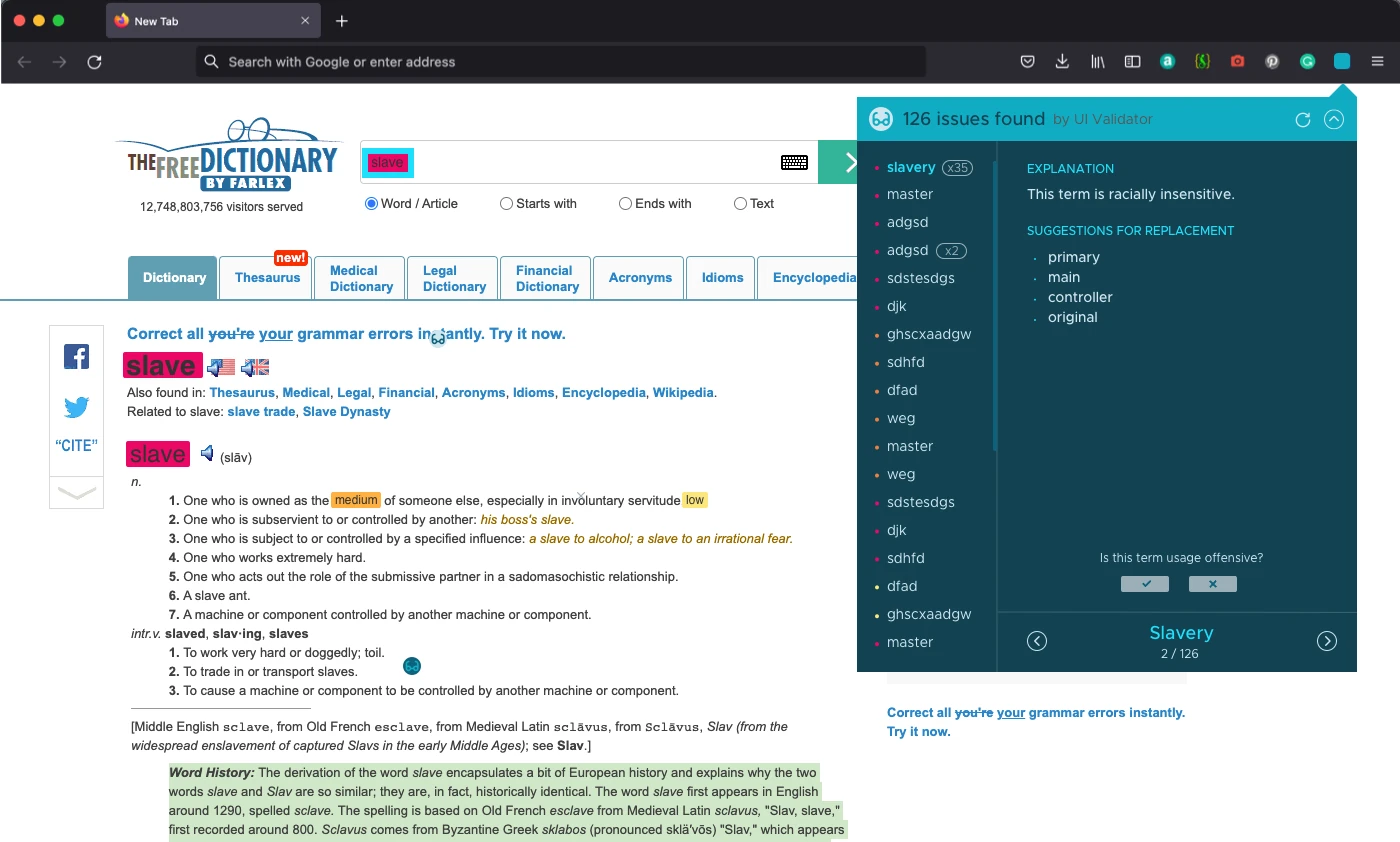
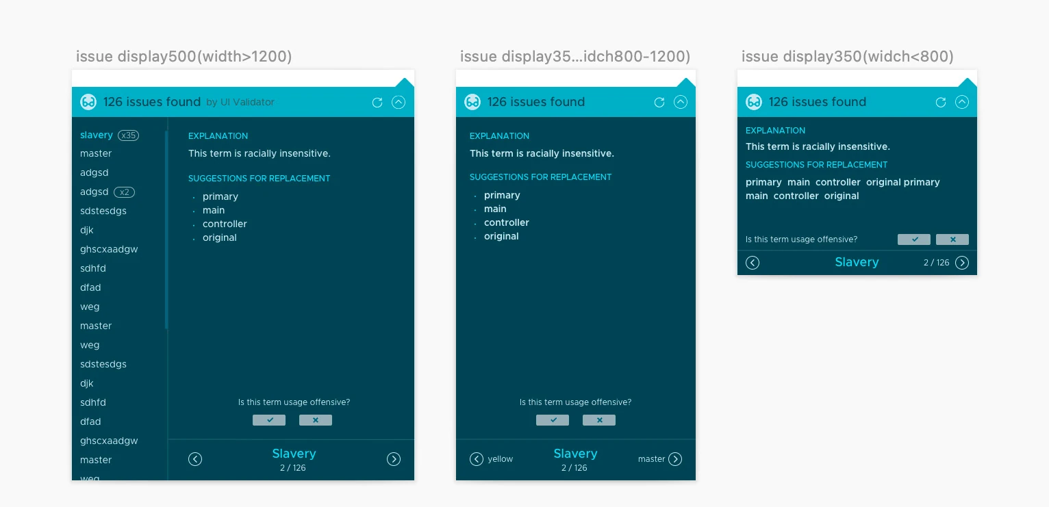
Built for wide screens, usable on narrow ones
The panel works best at 1,400 px and wider, with layouts for medium and narrow windows.
Readable for people with colour weakness
Highlights use a contrast ratio of about 6:1, and alternative colour themes let people with colour weakness choose what they can tell apart.
Severity at a glance
High, medium and low severity each have their own highlight colour on the page.
Tianxianjun (Beijing 3-Farmer Tech)2018–2019
Tianxianjun: one system for orders from every delivery platform
An all-in-one system for fresh-food stores: it collects orders from every delivery platform, calls riders, and puts a shop’s goods on all platforms in one step. It also helps small neighbourhood stores turn their community groups into orders.
- Role
- Co-founder
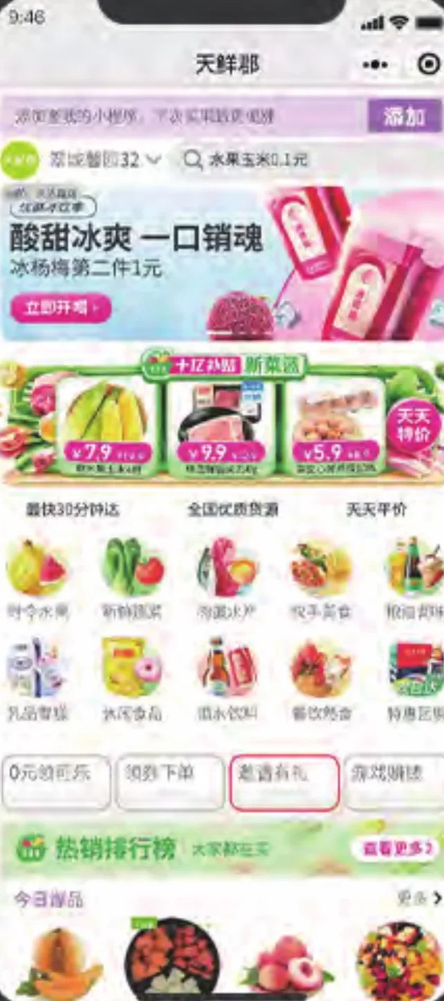
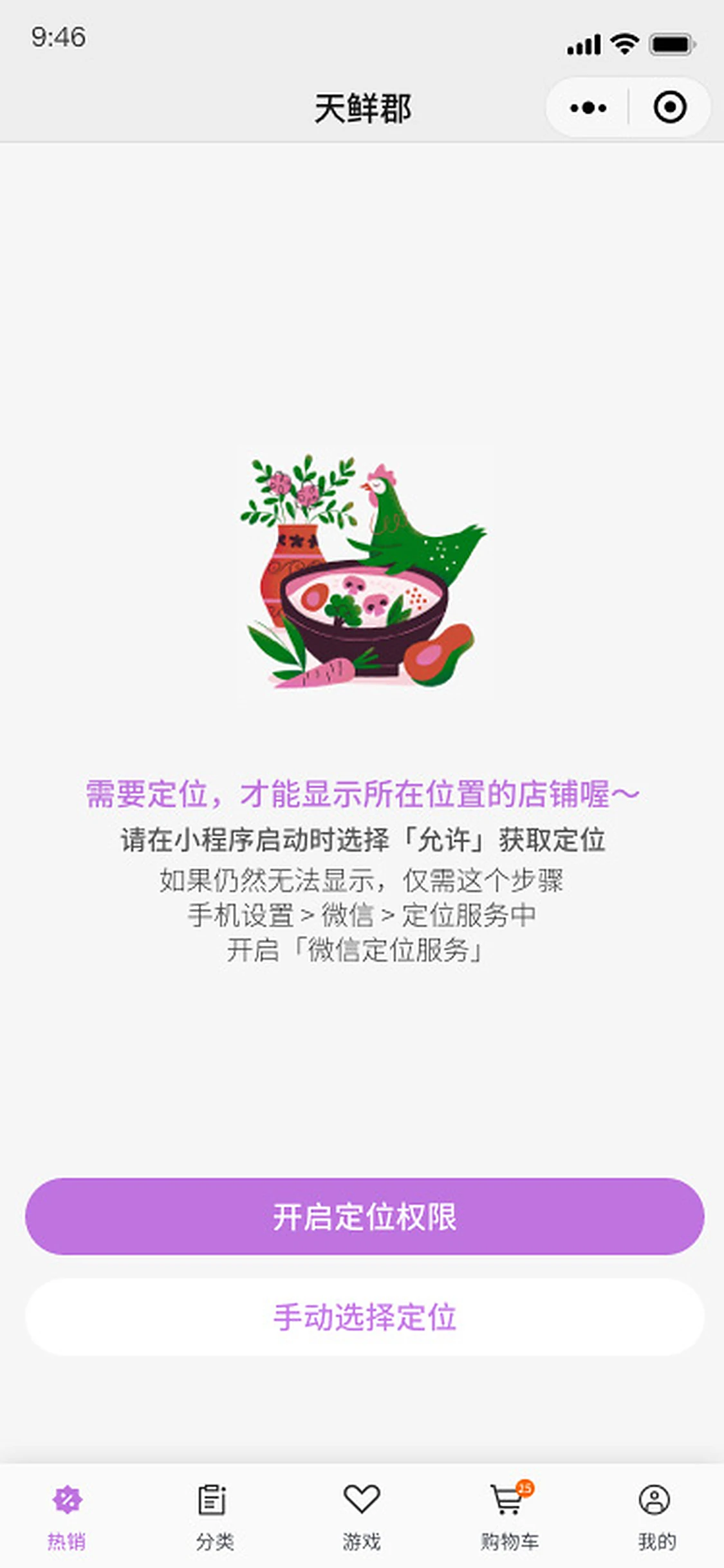
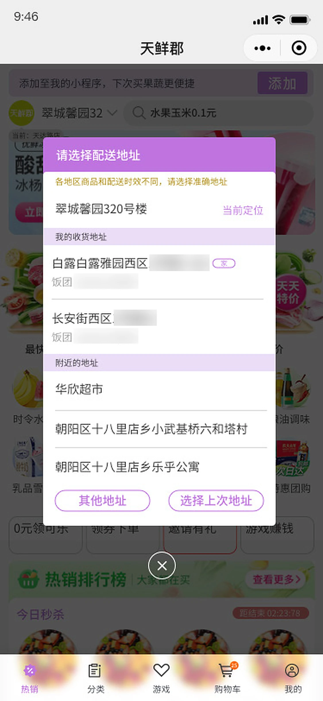
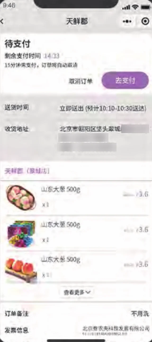
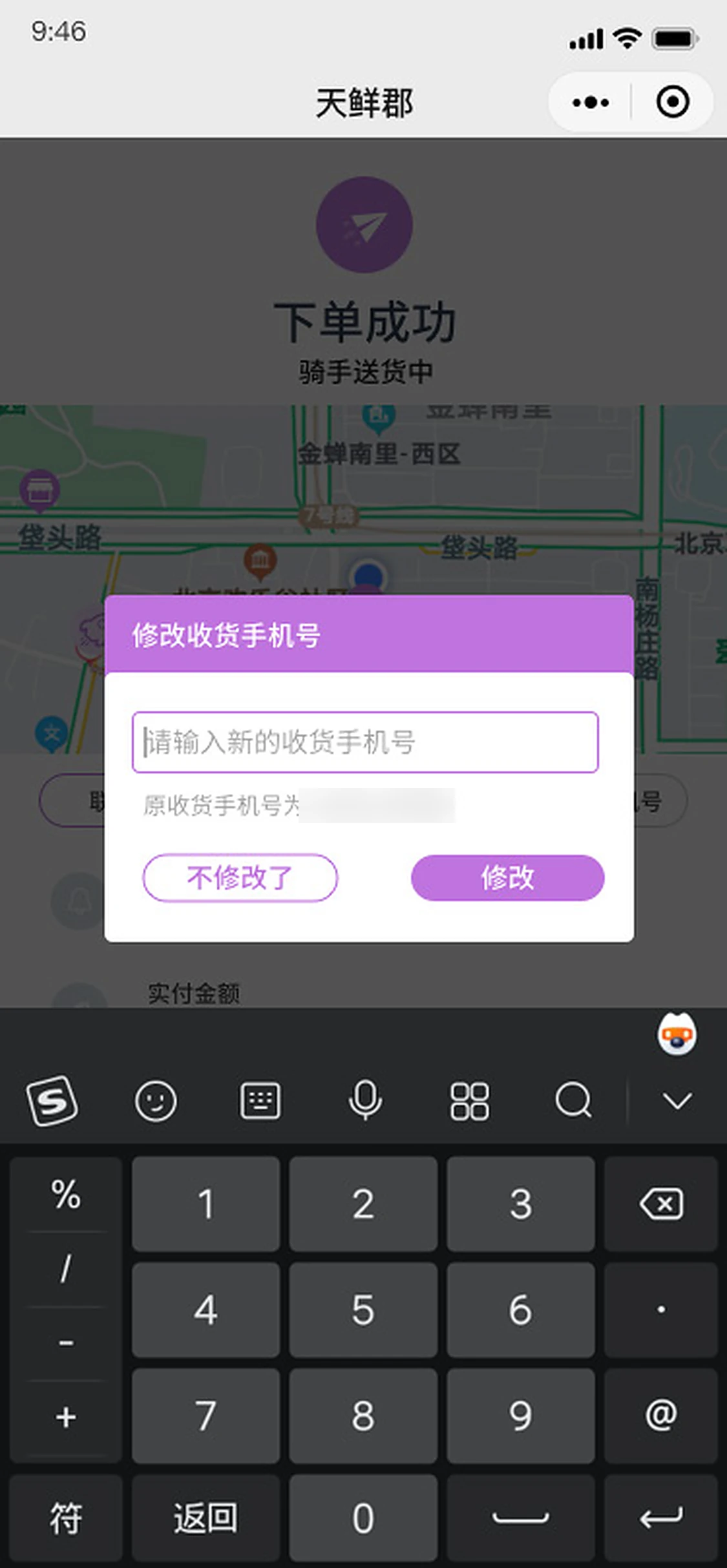
Phone numbers and door numbers are blurred.
Show the right store
New customers see the nearest store. If someone is more than 3 km from their saved address, they choose between that address’s store and the nearest one.
One queue for every platform
In the store app, orders from all platforms arrive in one list, sorted by priority. Easily missed requests, such as scheduled delivery, invoices and notes, are highlighted.
Never wait on one rider platform
If the preferred delivery platform does not respond within 15 minutes, the system calls all of them.
Alibaba Health2014–2016
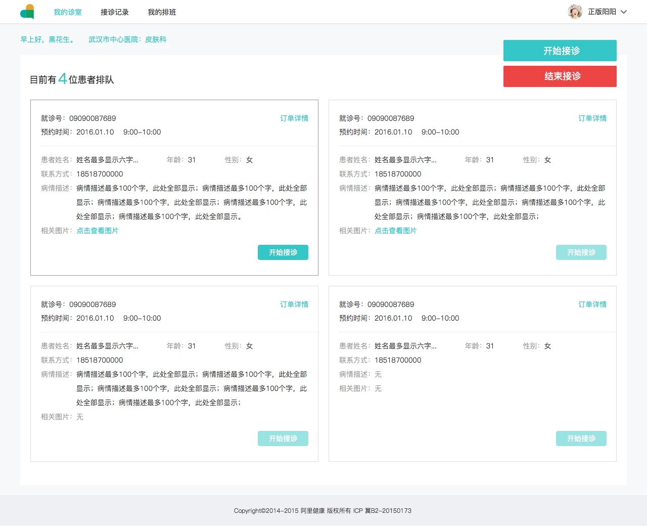
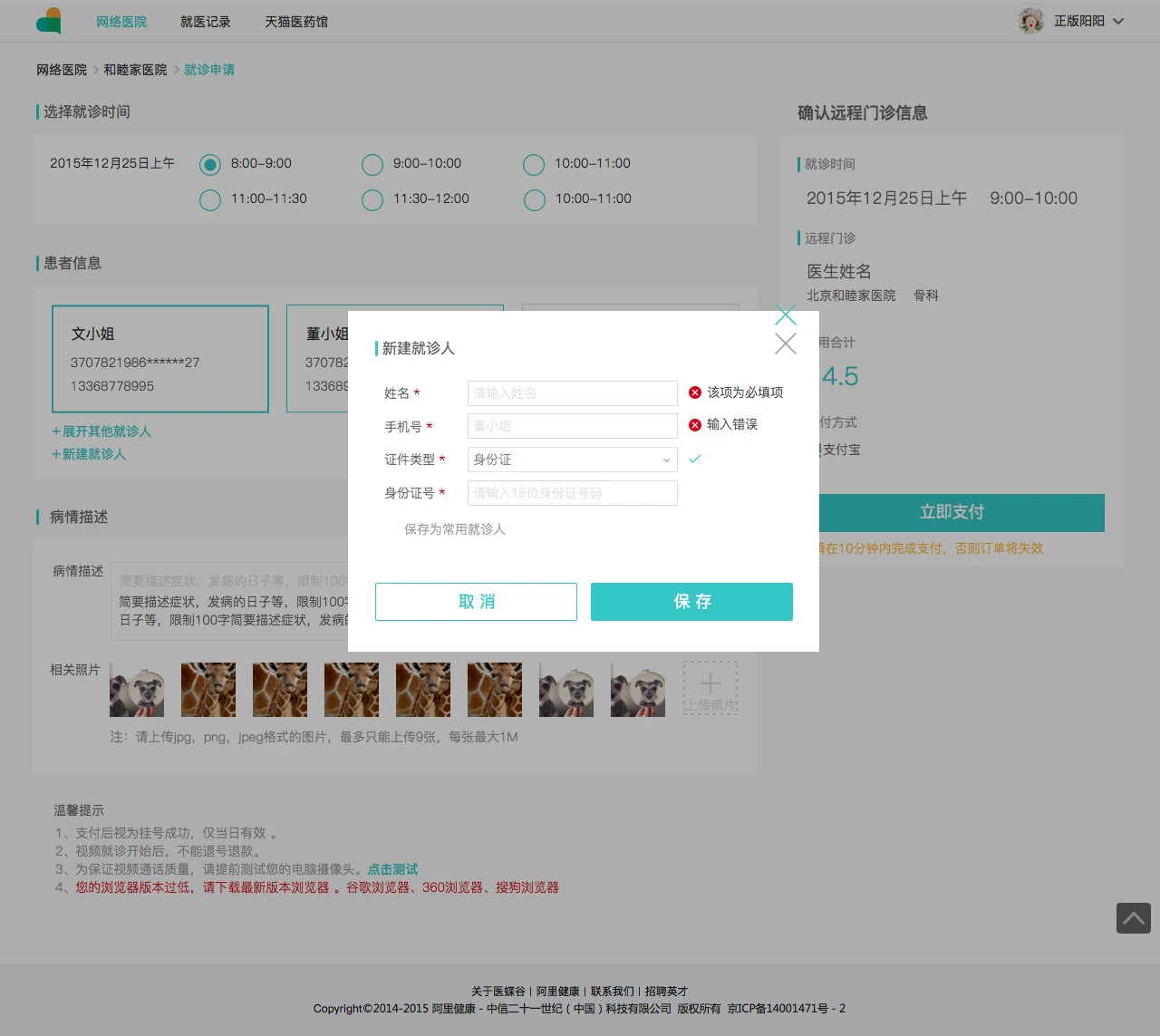
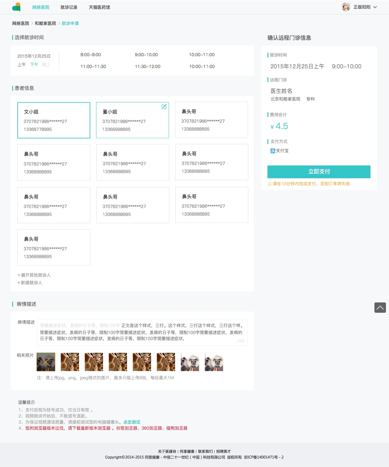
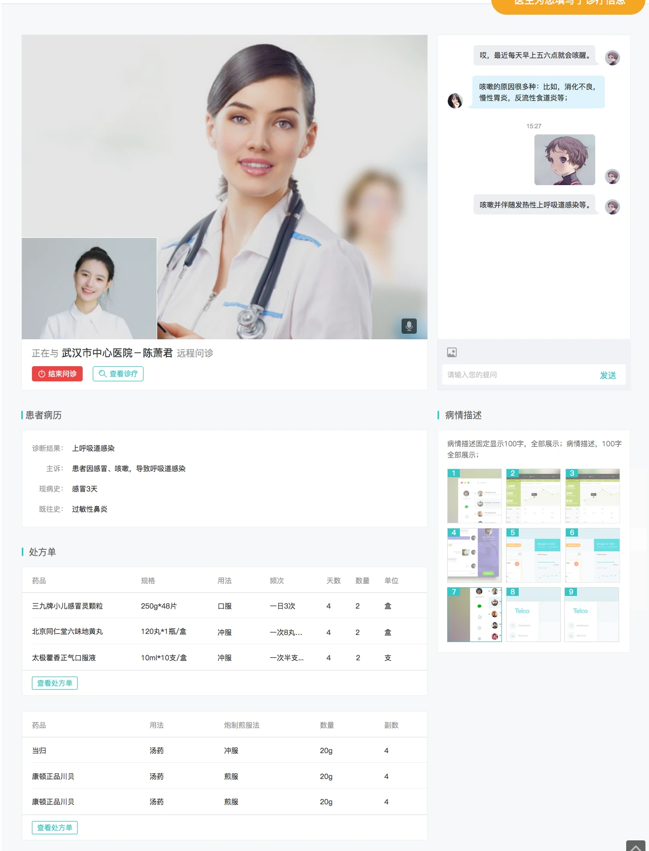
Alibaba Health: online medical services for patients and doctors
I led product design across the Alibaba Health app for iOS and Android, the website for doctors, and campaign pages for Tmall, Taobao and Alipay, including 11.11 and 618. I also designed the Alibaba Health logo.
- Role
- UED Lead, led a team of 7
- Patient app
- Family doctor, online consultation with photos and messages, video visits, e-prescriptions, registration, O2O pharmacy orders
- Doctor website
- Video consultations, e-prescriptions, registrations, case history and medical records
Adobe China R&D2011–2014
Adobe Translation Community
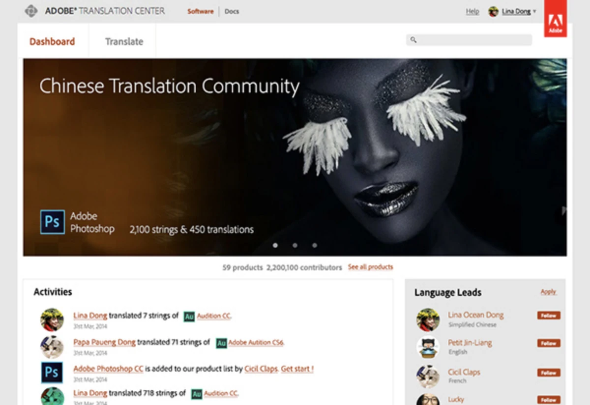
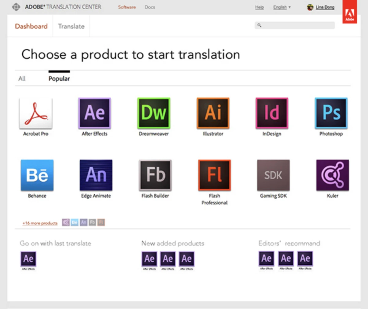
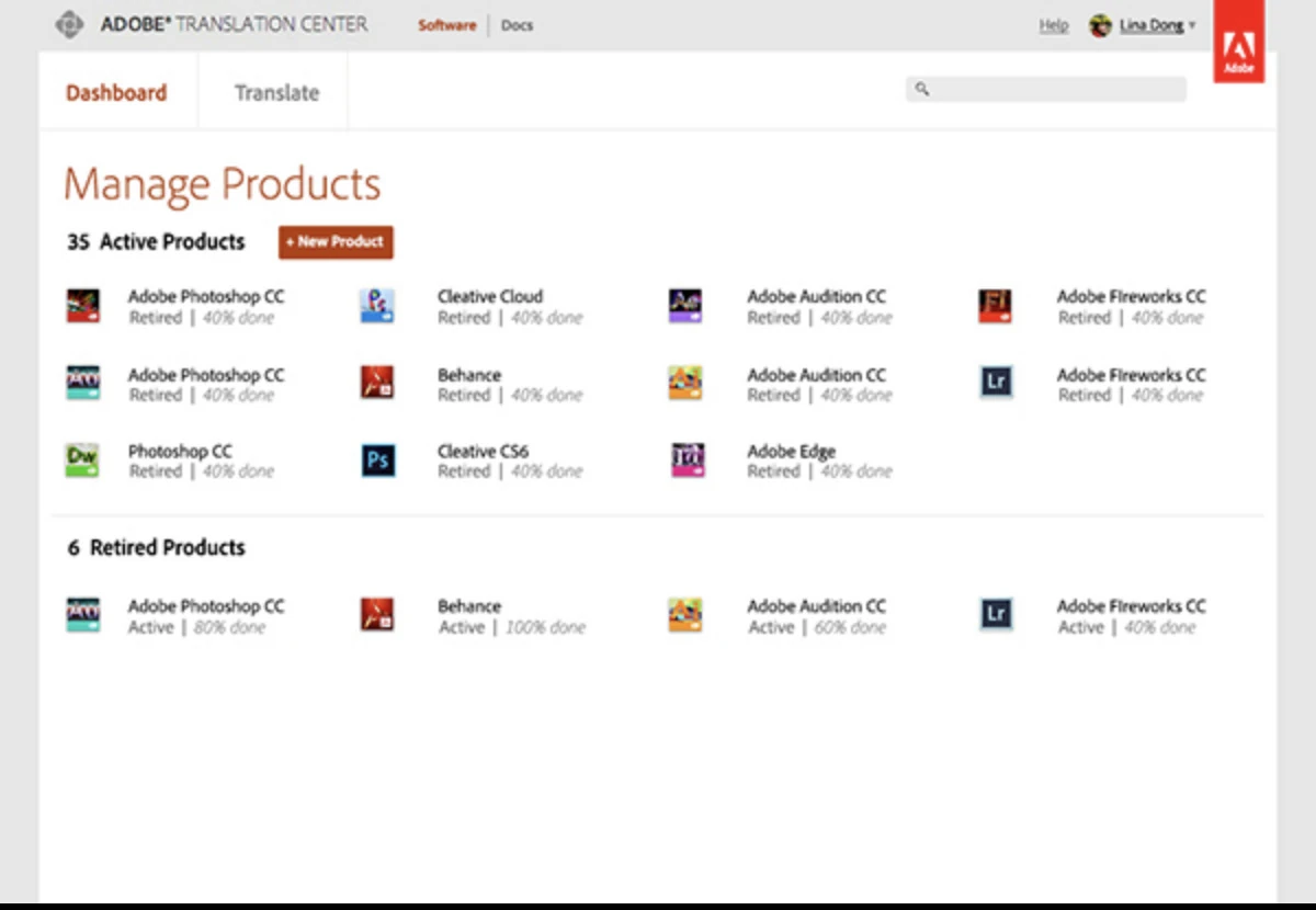
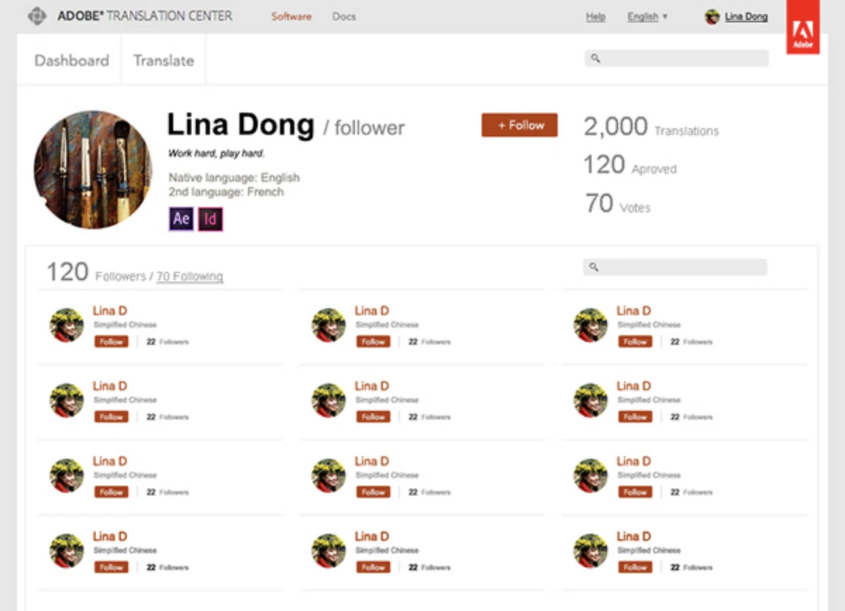
A web community where volunteers translate Adobe products into Chinese. Translators pick a product, translate its strings, and build a public profile; language leads review their work.
- Role
- User Experience Designer, the first full-time product designer at the Beijing R&D centre